Purpose
Today we live in a world of information explosion. There's lots of websites that provides plenty of useful information.
Unfortunately, it doesn't mean those information can be easily read, noticed and absorbed by users. Sometimes reading lines and lines information can be tiring. Sometimes information needs to be reorganised manually in order for them to be analysed and compared.
Those above are some factors that can contribute to a bad user experience on a website.
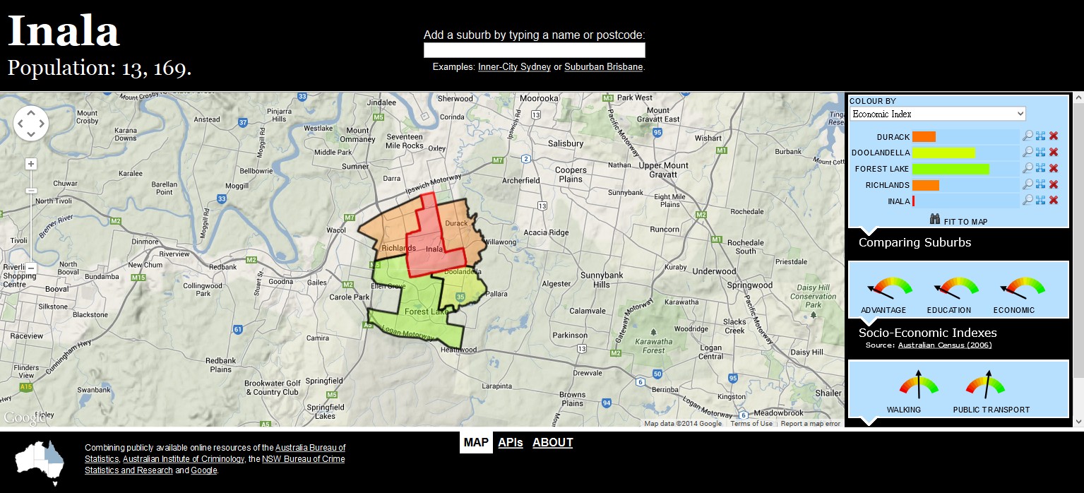
What if information can be pre-organised to a certain degree and that results in a better user experience? What if we visualise the information through an interactive map?
We created the Living Map Australia concept based exactly:
Deploying dynamic information onto interactive maps.
We believe that this type of information visualisation is fun, easily navigated, and can improve user experience. Have a read through our FAQ and DEMO, and see what Living Map Australia is about.
Relative Website
Suburban Trends